Finding Oil Tanks With GBDX Image-filtering Algorithms

One of GBDX’s most promising capabilities is its ability to identify and quantify a vast assortment of different objects visible in high-resolution satellite imagery. But GBDX’s strongest attribute—its ability to provide a very specific data set—sometimes creates an interesting dilemma: what’s the fastest, most cost-effective way to create a desired GBDX outcome?

We have seen the power and flexibility of artificial intelligence algorithms in the past, as  when we successfully used a neural network architecture to identify properties with pools in Australia and remote villages in Nigeria. But training and deploying an effective model is expensive and slow, and while cloud-based computation is relatively cheap, the costs of feature detection do start to add up when you move from a relatively compact AOI to a regional or global scale. What are the alternatives?

Protogen (short for PROTOcol GENerator) is a geospatial image analysis and processing software suite developed within DigitalGlobe and available to GBDX subscribers. It uses state-of-the-art hierarchical image representation structures (called ‘trees’) to efficiently access, retrieve and organize image information content.

Here’s a real-world example of Protogen’s potential. Estimating oil reserves through analysis of high-resolution satellite imagery has become fashionable in geospatial analytics. Oil is typically stored in tanks with floating roofs. As the oil level (and therefore the lid) sinks, the shadow that’s cast on the inside of the tank (and is visible in Earth imagery) provides a good estimate of the fill level. A pretty neat idea.

But how are these oil tanks (regardless of fill level) detected in the first place? With sufficient training data, a neural network can probably learn to identify them—but as we’ve already established, this might not be the most efficient path. What are the other possibilities?

Oil tanks are distinctive. They’re round, they’re relatively big, and they look like bright disks when filled. Using the Protogen max-tree, we can extract oil tanks by simply selecting the max-tree nodes which satisfy certain size and compactness requirements. Here’s an example:

Max-tree filtering at its finest.

We’ve filtered a WorldView-3 panchromatic image chip from Houston, TX, to extract features with size between 100m2 and 3500m2, and compactness greater than 0.97 (1.00 being a perfect disk). For an image of this size, this filtering operation is instantaneous.

If we want to increase recall, we can decrease the minimum compactness. Here is another example if we set this value to 0.8:

We have found most of the tanks but taken a hit in precision.

We’ve picked up most of the tanks and a bit of noise. Not really a problem: we can use our crowd to weed out the false positives as we have successfully done in the past. You can imagine this workflow at scale: Protogen detects oil tank candidates on an entire strip then the crowd cleans up the results. Much faster than having the crowd scan the entire strip and much more accurate than doing it strictly with Protogen.

Protogen also includes a vectorization module that produces a geojson file with the bounding boxes of the detected oil tanks:

Oil tank bounding boxes.

Having vectors makes it easy to count. According to Protogen, there are 133 oil tanks (give or take!) in this image segment.

GBDX makes it easy to run Protogen at scale. You can explore a full-resolution slippy map of oil tanks in Houston here. How about a different location? Want to find all the oil tanks in Cushing, OK?


Protogen 2


The orderly spots to the north and south of the image center correspond to oil tanks, while the randomly scattered spots are noise. Check out this close-up:

cushing_closeup_1

Only missed a few of the non-obvious ones!

You can find the full story here. We are currently working on improving the accuracy of our oil tank detector by using Protogen’s Land Use Land Cover classification method on the multispectral image in order to filter out false detections on soil and water, as well as combining Protogen with Machine Learning. Stay tuned for updates!

Detecting population centers in Nigeria

Interesant algoritmul… de citit. Mai  jos se afla si un link cu sursele de date, pentru cei care vor sa afle mai multe sau sa experimenteze direct.

There are large regions of the planet which (although inhabited) remain unmapped to this day. DigitalGlobe has launched crowdsourcing campaigns to detect remote population centers in EthiopiaSudan and Swaziland in support of NGO vaccination and aid distribution initiatives.This is one of several current initiatives to fill in the gaps in the global map so first responders can provide relief to vulnerable, yet inaccessible, people.

Crowdsourcing the detection of villages is accurate but slow. Human eyes can easily detect buildings, but it takes them a while to cover large swaths of land. In the past, we have combined crowdsourcing with deep learning on GBDX to detect and classify objects at scale. This is the approach: collect training samples from the crowd, train a neural network to identify the object of interest, then deploy the trained model on large areas.

In the context of a recent large-scale population mapping campaign, we were faced with the usual question. Find buildings with the crowd, or train a machine to do it? This led to another question: can the convolutional neural network (CNN) that we trained to find swimming pools in Adelaide be trained to detect buildings in Nigeria?

To answer this question, we chose an area of interest in northeastern Nigeria, on the border with Niger and Cameroon. DigitalGlobe’s image library furnished the required content: nine WorldView-2 and two GeoEye-1 image strips collected between January 2015 and May 2016.

We selected four WorldView-2 strips, divided them into square chips of 115 m per side (250 pixels at sensor resolution) and asked our crowd to label them as ‘Buildings’ or ‘No Buildings’. In this manner, we obtained labeled data to train the neural network.

Training the model

The trained model was then deployed on the remainder of the strips. This involved dividing each image into chips of the same size as those that we trained on, then having the model classify each individual chip as ‘Buildings’ or ‘No Buildings’.

Deploying the model

The result: a file which contains all the chips classified as ‘Buildings’ or ‘No Buildings’, along with a confidence score on each classification.

Results

Here are sample classifications of the model:

Sample classifications. The model confidence increases with building density.

The intensity of green is proportional to the confidence of the model in the presence of a building. It is apparent that confidence increases with building density. The model is doing its job!

What is the neural network actually learning? Below are examples of hidden layer outputs produced during classification of a chip that contains buildings. Note that as the chip is processed by successive layers, the locations of buildings become more and more illuminated, leading to a high confidence decision that the chip contains buildings.

The network ‘illuminates’ the buildings in the chip!

Here is a bigger sample of the results. A quick check on Google maps shows that most of these villages are not on the map.

Remote villages in the middle of the Nigerian desert. Green intensity represents confidence in the presence of buildings.

So to answer our original question: yes, the same neural network architecture used successfully to detect swimming pools in a suburban environment in Australia can be used to detect buildings in the Nigerian desert. The trained model can classify approximately 200000 chip (a little over 3000 km2) on a GPU-equipped Amazon instance. GBDX allows the parallel deployment of the model over an arbitrary number of strips — making continental-scale mapping of population centers a reality.

You can find the full story here and a link to the full-resolution map for a subset of the area of interest here.

https://platform.digitalglobe.com/detecting-population-centers-nigeria/

Monitoring Coastal Change With Multispectral Imagery

Foarte interesant!

Driven by tides, powerful sea currents and overall climate change, coastal change threatens shore communities and local economies. Accurate detection and measurement of coastal change can inform scientific investigations and facilitate flooding disaster preparedness and mitigation.

What do we mean by coastal change detection and measurement? We want to find where water has replaced land and vice versa, as well as the extent of these phenomena. So we developed an end-to-end GBDX workflow for coastal change detection and measurement at the native resolution (<2 m) of our 8-band multispectral imagery.

Let’s consider a sample area of interest that you may be familiar with: Cape Cod, a region well known for extreme changes in the coastal landscape. The image boundaries and their intersection are shown in the following figure.

Coastal Change - Cape Cod

The workflow takes two roughly collocated images of Cape Cod, captured in 2010 and 2016 by WorldView-2 and WorldView-3, and computes coastal change on the entire images, roughly an area of 1500 km2 in less than 30 minutes. Change is detected by aligning the two images, computing a water mask in each one, and then overlaying the two masks to compute the difference.

Water masks, before and after. White is water and black is land.

Results

This a close-up of an area where water has retreated, most likely due to extreme tidal effects.

Before close-up

After close-up

And here is the change heat map:

Coastal change heatmap

The colors represent the degree of water retreat. Note that in some areas the water has retreated by 1km!

Here is a snapshot of the Chatham area. Red indicates water loss and green indicates water gain. Note that water loss is due to tidal effects, while water gain is most likely due to shifting sand bars.

Chatham area

And here’s a snapshot of the Marconi transatlantic wireless station area. The red blob on the left indicates the presence of a tidal marsh.

coastal-change-marconi

Have these dramatic results and images caught your attention? You can find the full story at gbdxstories.digitalglobe.com/coastal-change, complete with Python code and a full resolution coastal change map!

https://platform.digitalglobe.com/detecting-measuring-coastal-change/?utm_source=facebook&utm_medium=display&utm_term=geospatial&utm_campaign=gbdx+content+marketing&utm_content=coastal+change

New Aspect-Slope Raster Function Now Available

By Aileen Buckley, PhD, Esri Research Cartographer
Aspect-slope map thumbnail

In 2008, I wrote a blog post about how to make and symbolize an aspect-slope map. This type of map simultaneously displays the aspect (direction) and slope (steepness) of a continuous surface (figure 1), such as terrain represented in a digital elevation model (DEM). In these maps, colors represent different aspect classes and simulate relief shading, which gives a three-dimensional impression of the terrain in a natural, aesthetic, and intuitive manner. Light colors (such as yellow) on northwest-facing slopes and dark colors (like blue) on southeasterly slopes give the impression of illumination from an imaginary light source at the upper left corner of the map. This produces a pattern of light and shadows that allows us to better see the form of the underlying terrain surface.

The original workflow has since been greatly streamlined when you use the new aspect-slope raster function available for downloaded from Esri’s GitHub repository for raster functions. This function makes it much faster and easier to create an aspect-slope map from raster elevation data, and it does not require a new output dataset to be created (although you can save the raster layer file if you want). With the new aspect-slope raster function, the data is processed and displayed all in one step. The function currently works with ArcGIS Desktop and ArcGIS for Server (called ArcGIS Enterprise in version 10.5).

Aspect-slope Map
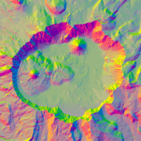
Figure 1. The aspect-slope map of the Crater Lake area in Oregon, USA

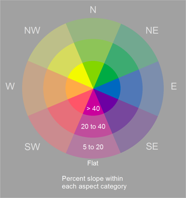
The aspect-slope raster function generates a map that categorizes aspect (surface direction) into eight classes that are symbolized using an orderly progression of color hues (what we normally think of simply as color, such as red, orange, and yellow) and slope (steepness) into three classes that are shown using color saturation (brilliance of color). Flat and near-flat areas are shown in gray. The aspect-slope map legend in figure 2 illustrates these colors.

Aspect-slope Map Legend
Figure 2. Aspect-slope map legend

The coloring is based on the Hal Moellering and Jon Kimerling MKS-ASPECT scheme described in a 1990 Cartography and Geographic Information Systems article (see the references below). With this scheme, the color hues, while remaining visually distinct, are arranged to simulate relief shading (a three-dimensional appearance) because northwesterly-facing slopes appear to be more illuminated (lighter in color) than the southeasterly slopes are. In an article from the AutoCarto 11 Symposia proceedings, Cynthia Brewer and Ken Marlow modified the MKS-ASPECT scheme by adding three slope classes and using color lightness in both the aspect and slope progressions to further enhance the perception of relief shading, which is crucial for visualizing the form of a continuous terrain surface.

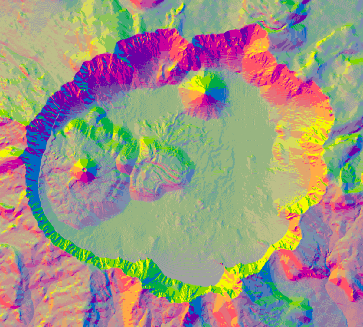
This excellent choice of colors might be more obvious to you on the map of Crater Lake than in the legend. In figure 3, notice that the conically-shaped cinder cones (inside the flat area of Crater Lake) are shown with the same aspect colors as in the legend, and the brightest colors are used because these cinder cones have steep slopes. If you squint, you should also be able to see a 3D effect that accentuates the cinder cones’ shape and makes them appear higher than the flatter area around them. The northwestern interior escarpment of the large crater that forms the lake basin also appears as though it is in shadow, while the southeastern interior escarpment appears illuminated.

Features shown with the aspect-slope colors
Figure 3. Craters, escarpments, and other landscape features shown with the aspect-slope colors

Try it yourself!

Here is a link to the Aspect-slope Python raster function documentation for creating an aspect-slope map in ArcGIS Desktop and ArcGIS Server. These instructions also contain a workaround for using an aspect-slope map in ArcGIS Pro.

If you want to try this out for yourself, download the Aspect-Slope_Map.zip file, which provides the aspect-slope raster function and a map document for the map shown in figure 4. The map document also contains a data frame with the aspect-slope map legend. The polygons used to make the legend are in the file geodatabase that is included in the download. The colors used for the legend are in the style file that is included in the download. You can use these resources to make the aspect-slope legend for your own maps.

The aspect-slope map you can download to try out this workflow
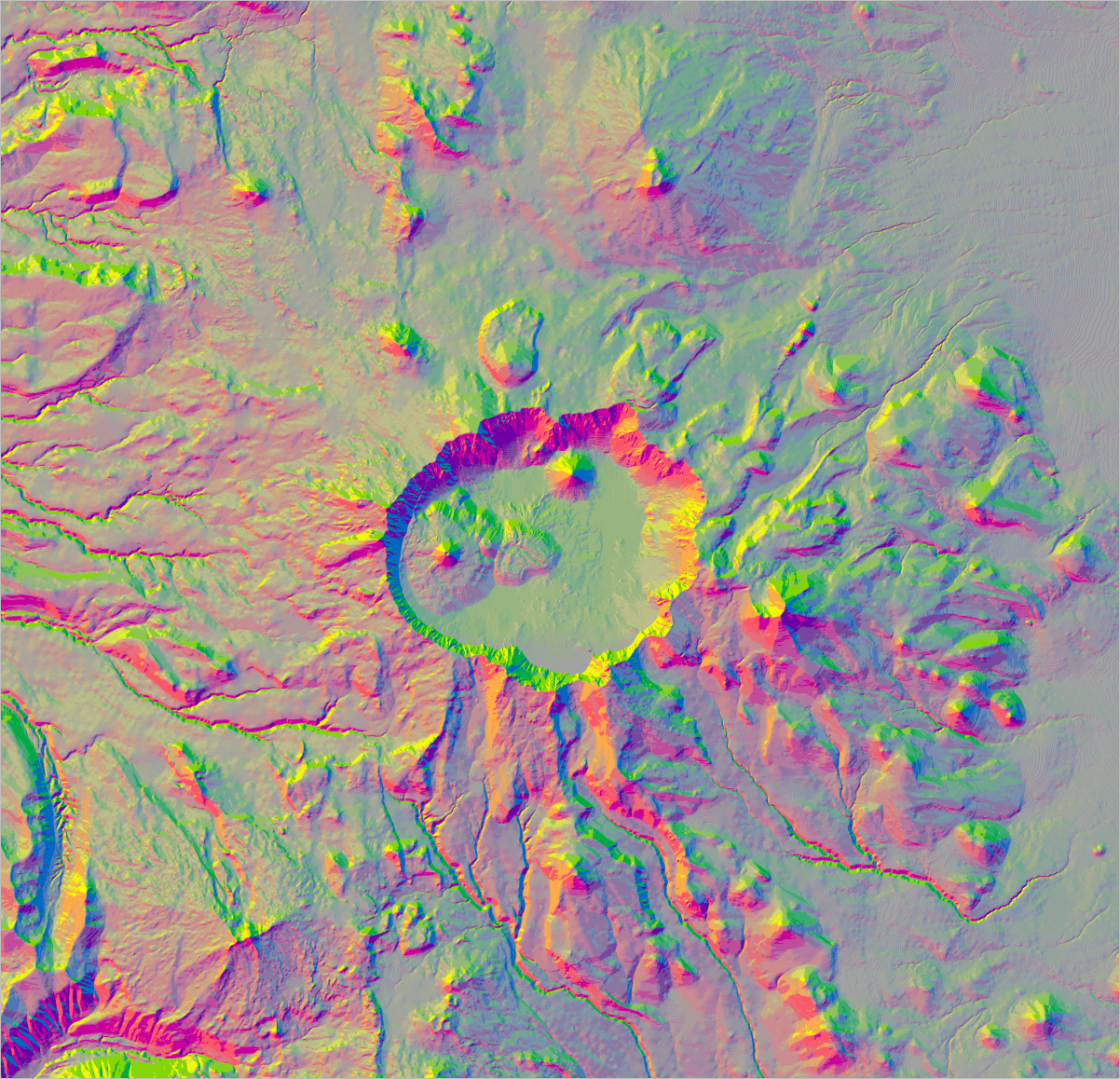
Figure 4. The aspect-slope map that you can download to try out this workflow

Try this out today!

For additional details about aspect and slope, the aspect-slope color scheme, DEM data, and raster functions, read on!

About aspect and slope

According to Map Use: Reading, Analysis, Interpretation, Eighth Editionaspect can be defined as “the downslope direction of the maximum vertical change in the surface determined over a given horizontal distance.” Think of this as the direction that the surface is facing. Slope is “the vertical change in the elevation of the land surface (rise), determined over a given horizontal distance (run).” You can also think of this as the amount of steepness (or the rise or fall) of the ground surface. Aspect maps, slope maps, and aspect-slope maps are usually made with raster data that represents an elevation surface (that is, a DEM, as in figure 5), but they can also be made for continuous surfaces of other data, such as population density or other statistics.

DEM data
Figure 5. A DEM for the Crater Lake area

About the aspect-slope color scheme

The cell values in the aspect-slope raster reflect a combination of aspect and slope. The cells have values that range from 11 to 48. Cells with values below 21 are flat and shown in gray. Other cells have values ranging from 21 to 48, as shown in figure 6.

Aspect-slope cell values
Figure 6. Cell values and their corresponding colors on the aspect-slope map

Cells with values in the 20s have lower slopes (from 5% to 20%), values in the 30s have higher slopes (from 20% to 40%), and values in the 40s have the highest slopes (greater than 40%). Cells with values that end in 1 have north-facing slopes, values that end in 2 have northeast-facing slopes, and so on.

About DEM data

You no longer have to find DEM data on your own, because Esri has created a multiscale terrain dataset for the world that can be accessed from ArcGIS Online. This layer provides data as floating-point elevation values suitable for use in analysis and with raster functions. The ground heights are based on multiple sources, and numeric values represent ground surface heights based on a digital terrain model (DTM).

To add this layer in ArcMap, choose the Add Data From ArcGIS Online option and search for Terrain (figure 6). (Note: In ArcGIS Pro, on the Portal tab of the Project pane, add data from the Living Atlas of the World and select Terrain.)

Adding the Terrain layer
Figure 7. Adding the Terrain layer in ArcMap

About raster functions

Raster functions are used with image and raster data to process and display the data. With raster functions, this processing is not permanently applied to the data—instead, it is applied on the fly as the images or rasters are accessed. This is similar to creating a layer file and defining the symbology for a raster dataset, such as defining a color ramp to be used with a DEM. The difference is that you have to save the layer file as a separate file, but you do not have to save the result after you apply a raster function. If you save and open the map document again, the raster function will still be applied (provided you have not moved it from its original file location).

If you want to save the results as a stand-alone layer that can be added to other maps or shared with others, you will need to save the raster with functions in ArcMap. To do that, you can use any of the following options:

  • Export the raster to an existing mosaic dataset
  • Save the raster layer file
  • Export the raster to any of the supported raster dataset file formats, such as an Esri Grid, so that the functions will be permanently applied

As an aside, in working with this new raster function, I came to realize that the colors in the original blog post were wrong (they were “preliminary colors in use before the map was exported to the Macintosh environment for color-scheme work in HVC”—Hue, Value, Chroma—as noted in the Brewer article). These have been corrected in the original blog post, and they are also correct in the new aspect-slope raster function.

References

Thanks to our colleagues at the Esri R&D Center, Sharjah—Abhijit Doshi, technical manager, raster solutions; Cristelle D’Souza, product engineer; and Angad Kundra, student at BITS Pilani Dubai Campus—for creating the aspect-slope raster function and making it available to everyone!

https://blogs.esri.com/esri/arcgis/2017/03/28/new-aspect-slope-raster-function-now-available/?adumkts=branding&aduc=social&adum=external&aduSF=facebook&utm_source=social&aduca=blog&aduco=Slope_Raster_Function&adut=3_29_17&aducp=branding&adbsc=social_branding_20170331_1412671&adbid=10155014549015281&adbpl=fb&adbpr=211211155280